– A supplemental indicator of performance saturation
* Back ground
In General, IT professionals use the average value and maximum value of a performance item (e.g. CPU usage percentage) over a specific period to measure or plan for server capacity.
However, servers are not busy for that entire period, only when they are executing specific tasks. The average value will also include any idle time. For this reason, the average value may not be a sufficient measure of how busy a server is. It would be greatly advantageous to have a supplemental indicator to increase confidence in what we can infer from the average values of performance.
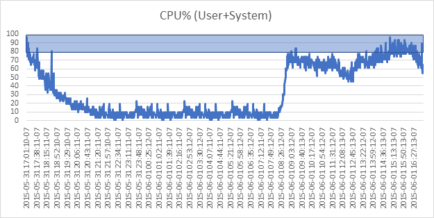
Consider the typical CPU behavior below of a server for one day.
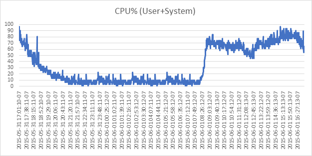
The average value of 34.16%, the 96.77% maximum value, and the chart taken together, are sufficient for IT professionals to understand how busy this server was.
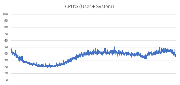
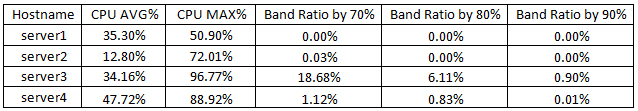
However, without the chart, it’s difficult to ascertain how busy this server was by knowing just the average value and the maximum value. Unfortunately innfortunatleyn practice, you don’t have the luxury to look at the charts unless something triggers your suspicion. More likely, you have a table listing servers’ average and max values as below, which is useful as you are also interested and need to compare the server of interest to other servers simultaneously as a group. (in the table below, server3 is the one charted above)
In the table above, you conclude with some confidence that server1 and server2 are fine, since they have low average and max values. However, a high average value with high maximum value for server 3 should trigger suspicions, or require deeper analysis.
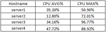
For example, the chart below shows server1- rather low average value and maximum value.
The average value of server1 is quite similar to server3’s average value, but the maximum value for server1 is 50.90%. In this case, even without the line trend chart available, you probably have nothing to be concerned about. So, low average and maximum values are clearly not a concern, but a low average value with high maximum value such as server3 ‘s should warrant additional investigation or concern. This becomes unmanageable when dealing with a substantial number of servers, either for lack of data, or lack of time.
Enter the band ratio or band average – how does it help in this situation?
* Band Ratio
Let’s take server3 as our example.
If we use the 90 percentile as an important performance threshold,
Band Ratio is : [Occurrence count of value is 90% or more] * 100 / [total data count]
→ 13 occurrence * 100 / 1440
Band Ratio (90 percentile) = 0.90%
If we use the 80 percentile as a threshold
→ 88 occurrence * 100 / 1440
Band Ratio (80 percentile) = 6.11%
If we use 70 percentile as a threshold
→ 269 occurrence * 100 / 1440
Band Ratio (70 percentile) = 18.68%
We find for server3, that:
90% threshold band ratio is 0.90%;
80% threshold band ratio is 6.11%;
70% threshold band ratio is 18.68%.
What can we derive from this data? It depends to some extent on your management and understanding of your servers and resources. In general, for this particular band ratio data, you’re able to determine with some confidence that server3 is fine for the immediate future capacity-wise. However, with a 70 percentile threshold band ratio at around 18%, it’s indication to either plan a capacity increase in the near future for this server, or flag it for closer scrutiny going forward.
In Summary, the surest way to analyze state of your servers is to analyze the raw performance data directly, and not rely on statistically-drawn information. If available and practical, trend line charts are a great help to visualize and understand the raw data of individual servers.
In the larger picture, the band ratio is especially valuable when IT professionals must analyze the performance of many servers, and has limited time or resources to analyze each server individually.
First, the band ratio taken with the average and max values weed out servers that are not in any danger with much greater confidence. Secondly, the band ratio highlight servers that will require future capacity upgrades, or closer scrutiny and monitoring. In addition, the band ratio average distribution shown graphically (as bar graphs) can provide an immediate warning of potential danger.
The true benefit is that you get all these without having to analyze each server’s raw data individually.
* Conclusion
In conclusion:
- Although average value and maximum value are exact values of performance, they’re inadequate to represent how busy a server is. Working time and idle time are lumped together in these metrics, and it is more realistic and important to determine whether this server is busy or not by considering the working time only.
- The Band ratio can be a very useful indicator to supplement this shortcoming of only using average value and maximum value.
- Note: In addition, it will be very helpful if a user-defined band ratio (such as 95%) is added to above table, next to predefined band ratio of 70%, 80%, and 90%.
ONA Plus support for Band Ratio
ONA Plus (onTune nmon Analyzer plus) presents the band ratio concept in an eidetic graph such as the one below:
70%, 80%, 90% and 95% Band Ration are presented together.
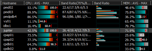
In the above table, the additional Band Ratio bar-graph presented is based on the following concept: (using the ‘jupiter’ server above as our example – it has the real CPU performance data below within a one month period.)
(ONA+ provides the chart below of real time performance data for ‘jupiter ‘)
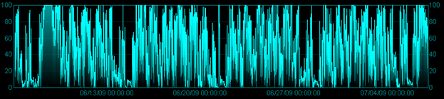
(EXCEL provides the cart below for the same data)
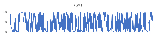
The average is 42.5% and maximum is 100%; the 70/80/90%/95% Band Ratio is 26.4%/19.4%/12.7%/9.5%.
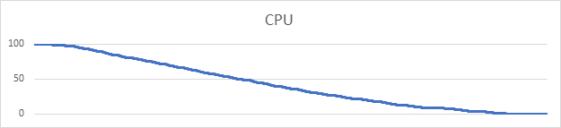
If we sort the above real data, we obtain the chart below:
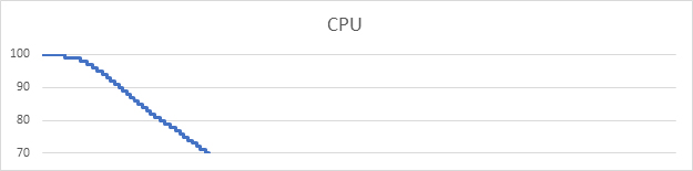
If we further simplify the result by taking only 70% and above as the meaningful range, we obtain the chart below:
Notice that the Band Ratio bar graph below presented by ONA + for ’jupiter’ represents the same thing.
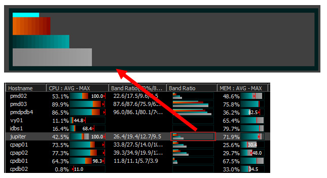
This bar graph is a powerful and very efficient means for the ONA+ user to visualize CPU utilization immediately, and quickly and correctly appraise the utilization profile of all servers
The band ratio is one of the unique features of onTune nmon Analyzer plus, an indispensable analysis and capacity management tool for nmon users. ONA Plus provides a wide, at-a-glance, summary views of your servers’ most meaningful performance data, organized to give you immediate insight to the state of your servers. At the same time, ONA + provides detailed charts of the performance data of each server for in-depth analysis.